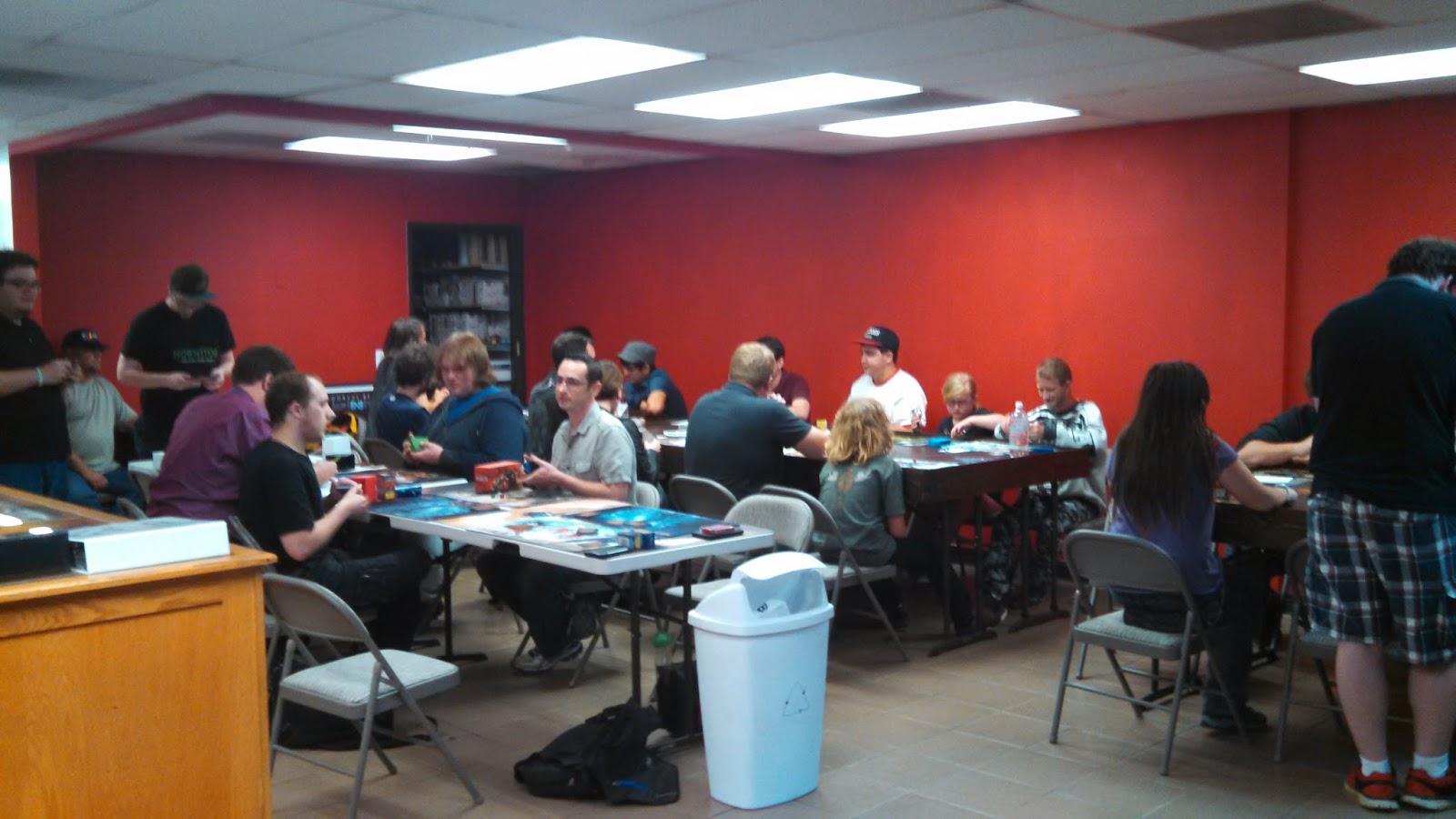
The store is covered in blood. Well, red paint. Justin, my partner, started a board game clothing company and produced some new AQ shirts that have a red line with our key symbols of meeples, dice and board game paraphernalia. From there we're changing the window to be a red line with our name on it instead of the busy green bits and posters that is now. We'll be covering the walls with board game art. Why are we doing all this?

The ambiance of the store is that of a playspace for most of our regulars. People come to play games that they enjoy and find others that do as well. The shoppe portion of the store is being revitalized so that we carry a diverse selection, ideally one of every type of game out there. Statistically speaking, the more games we have in stock, the better odds that someone coming off the street or playing games can find the one they're looking for at the time. Going with a more modern look should attract more adult gamers, which are 98% of our clientele. In this way we hope to get our beer license out of the way this summer sometime so that they do adult activities like drinking with their favorite hobby as well.

I think the appeal of AQ has long since been that we provide a clean, well-lit, and non-gamer-smelling shoppe compared to a lot of stores people are used to. We want to be a retail store first, a community second, and a resource to players of all ages third. People are always remarking how much they like the look or feel of the store, so our intentions in changing its' color and interior design is only to exemplify that fact going forward. If we can make the store ultimately appealing to every single person who enters because we're different from what they expect then it has the potential to provide long term retention and dividends. Our Five Stars rewards program concept is paramount to that, as it namely rewards regulars with persistent discounts and deals and helps brand new people remember what we're about with reminders that we are running events and here to support their gaming choices.
The warm glow of red in the store should also psychologically encourage more eating when we have better food options and make the store more homey during the gray winter months as well. Stores like
Haunted Game Cafe and shoppes in Oregon we've researched have similar color schemes as well as a few bars around the Denver area. Red jumps out at you, says "Hey, we're here. We know exactly what we're about and we want to better serve you because of it." It's not a passive color and I think that reflects our personality as AQ strives to succeed into our second year of being in business.